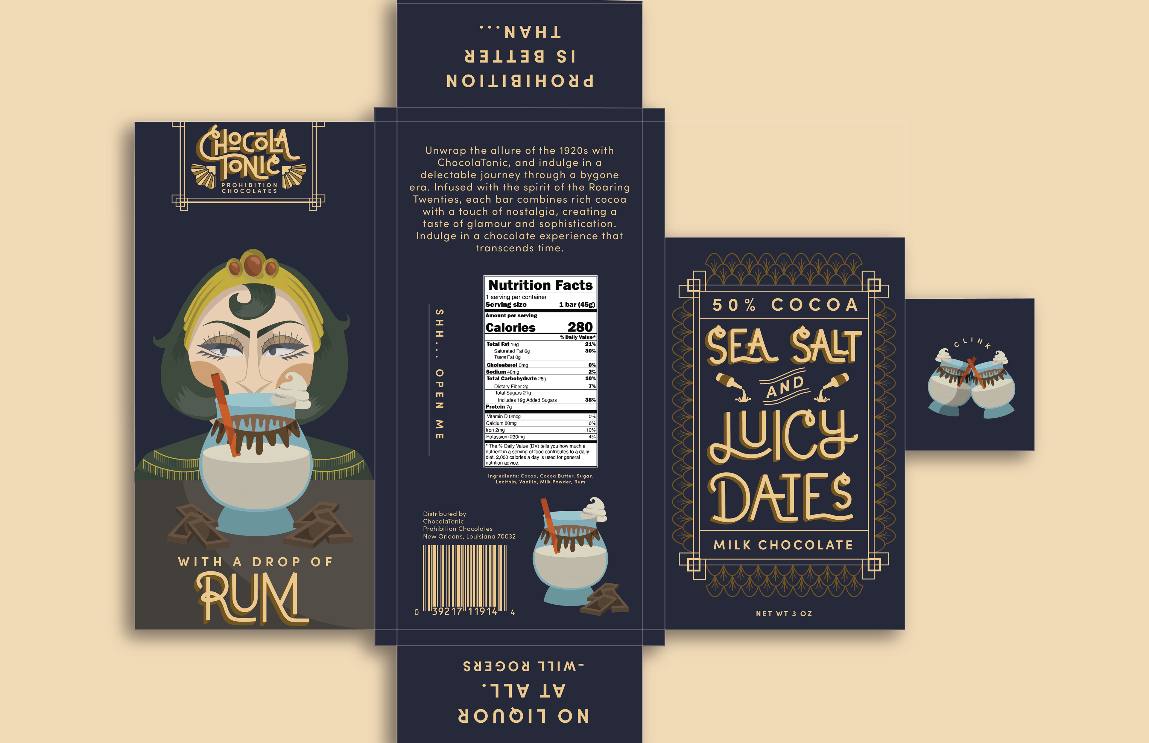
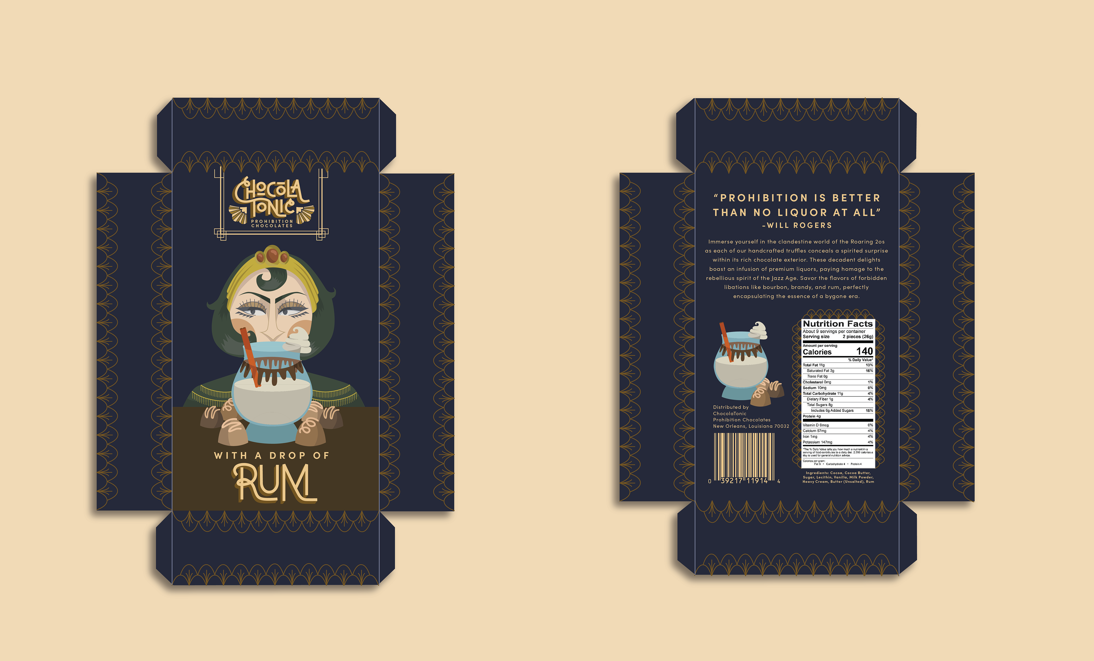
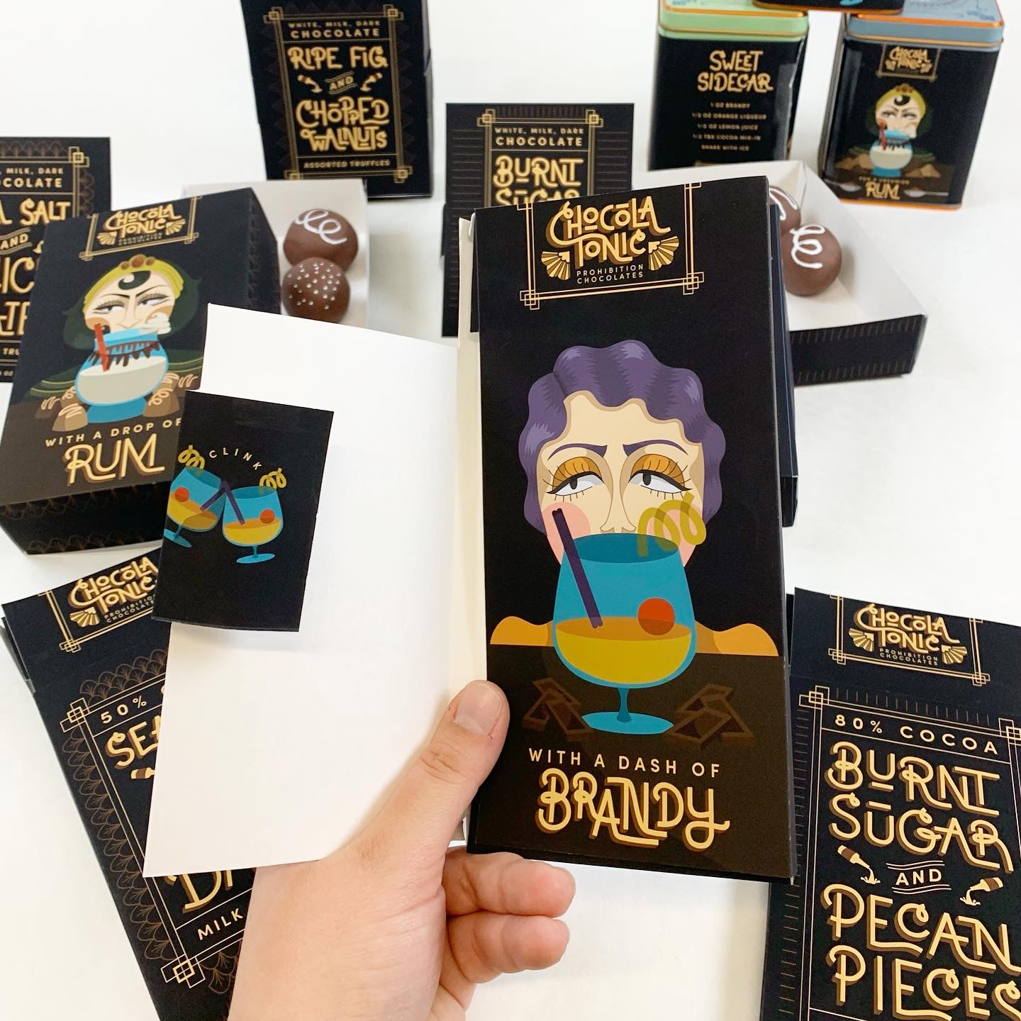
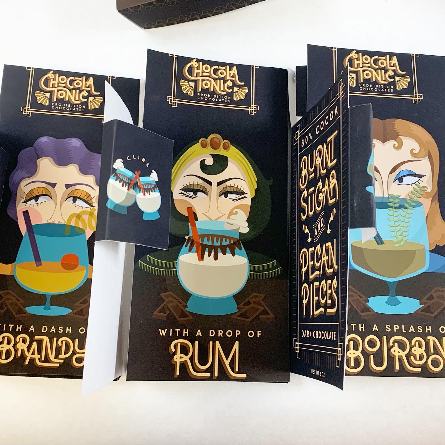
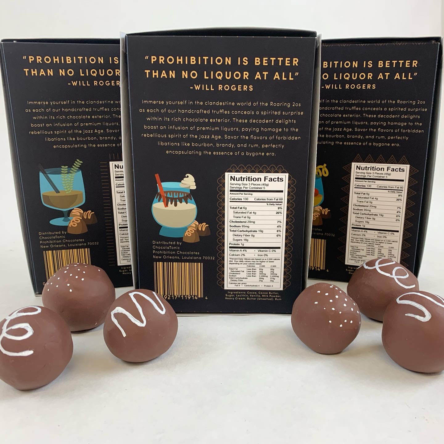
Chocolate has some of the most interesting and beautiful packaging on the market, and that can be hard to compete with. To stand out, the package must provide an intimate experience from the shelf all the way to the moment of consumption.
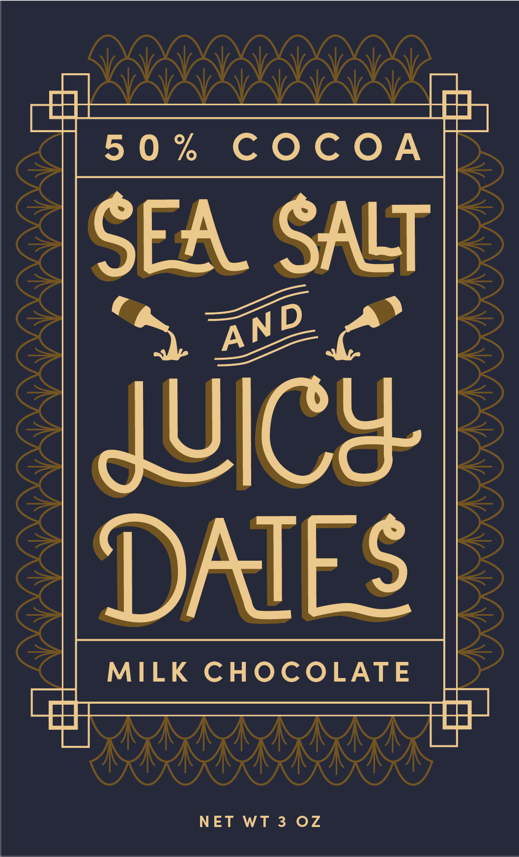
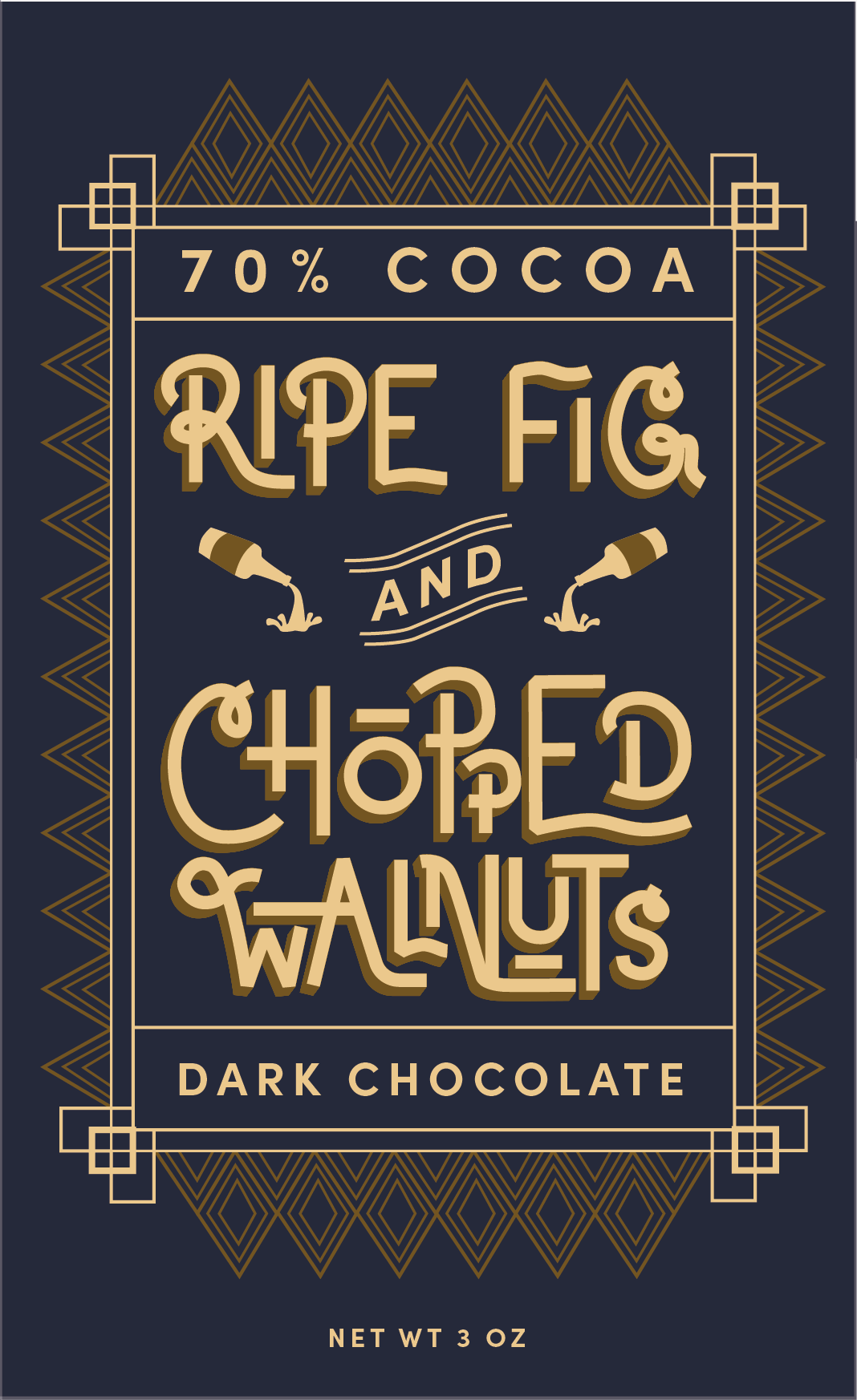
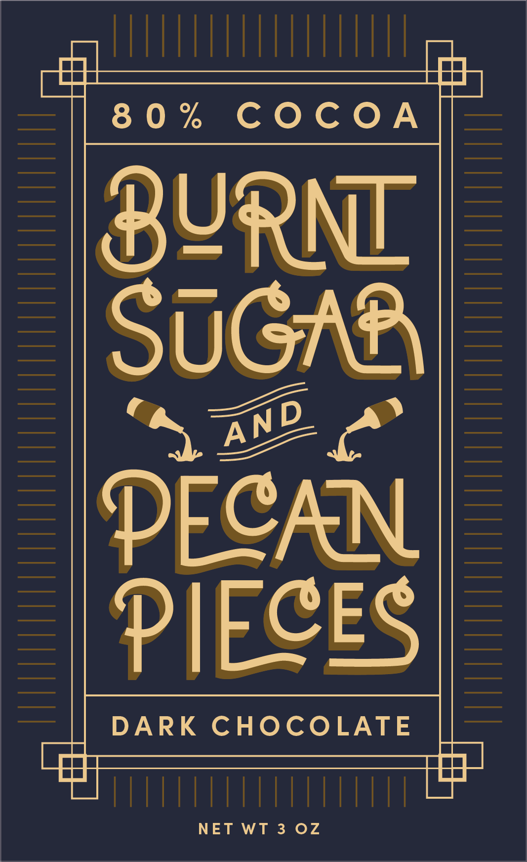
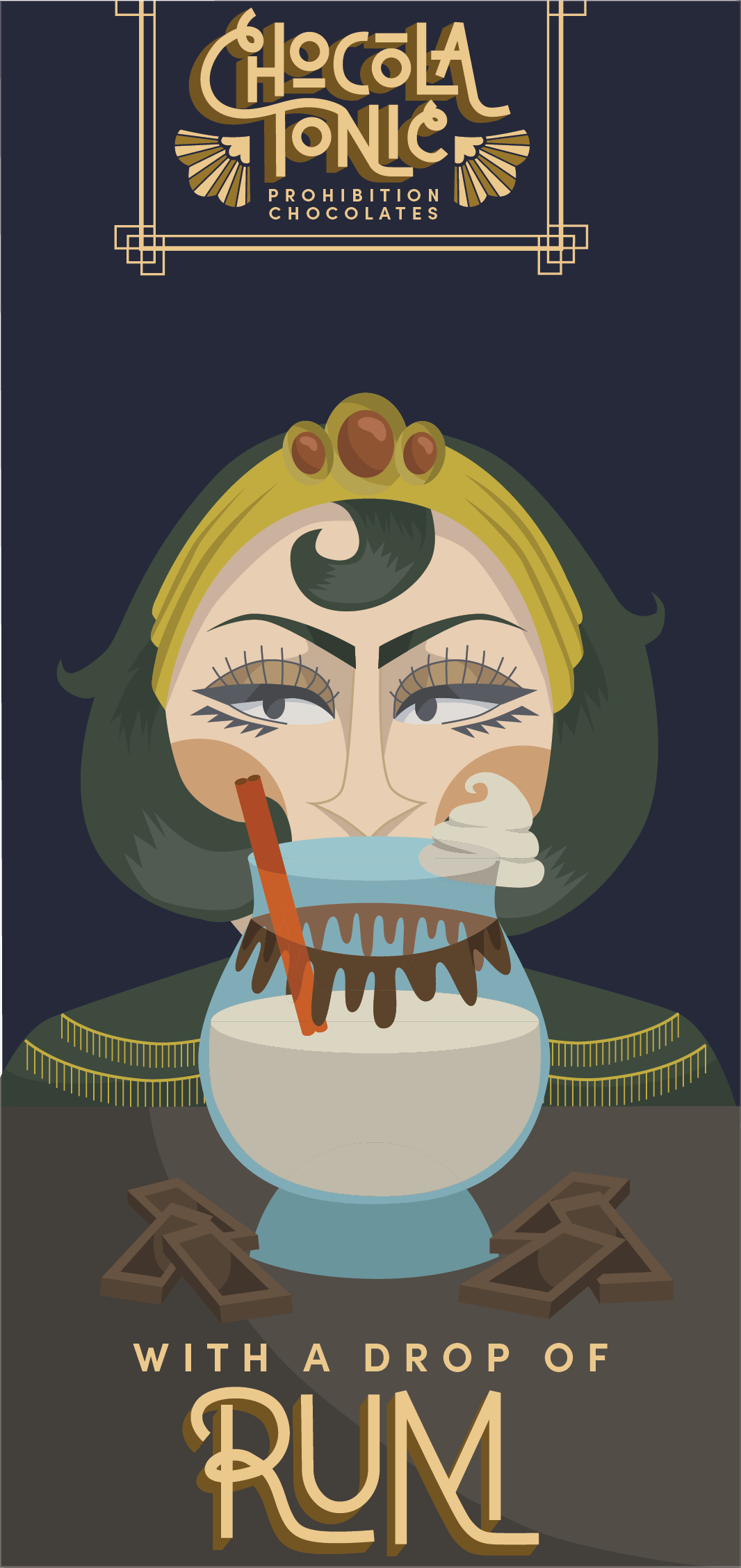
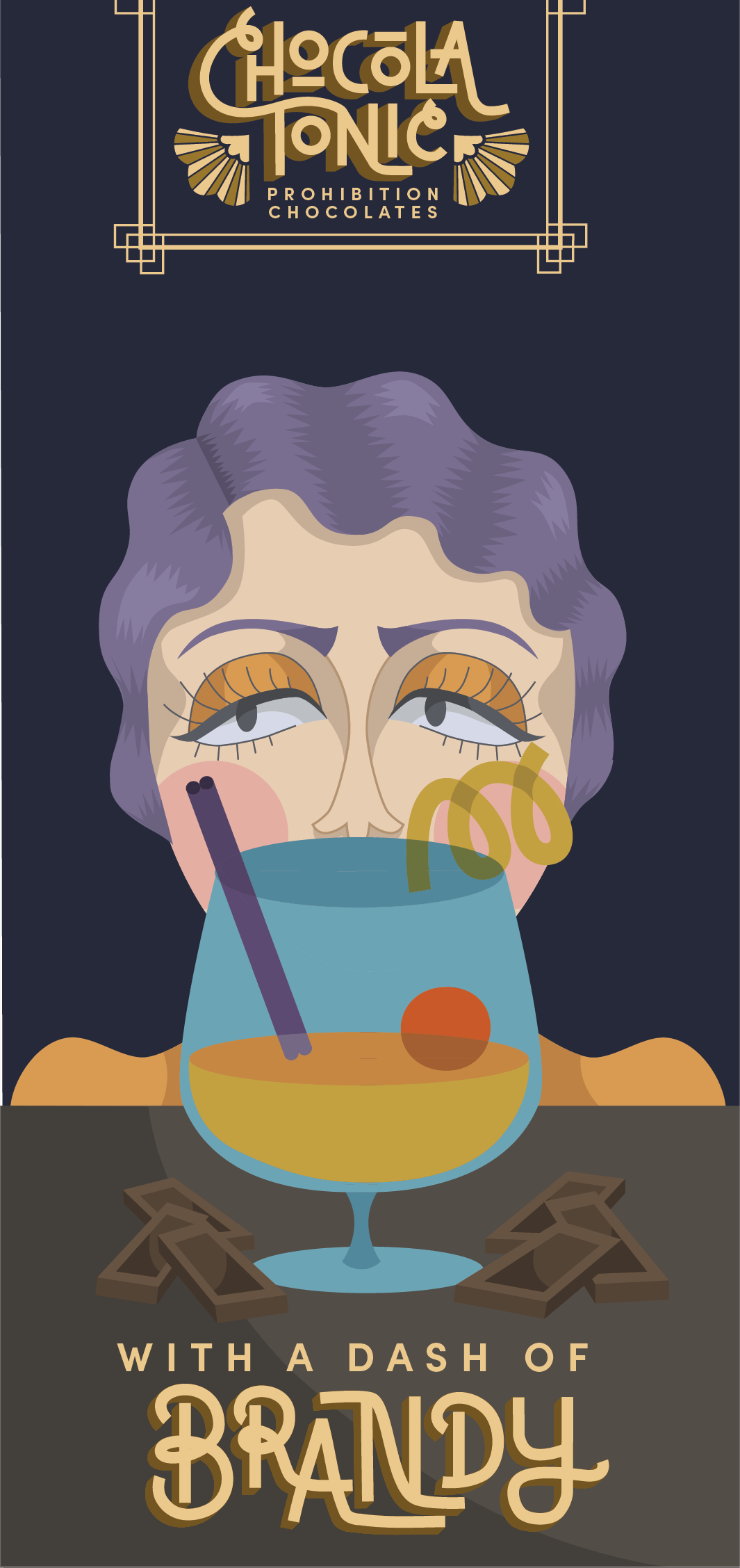

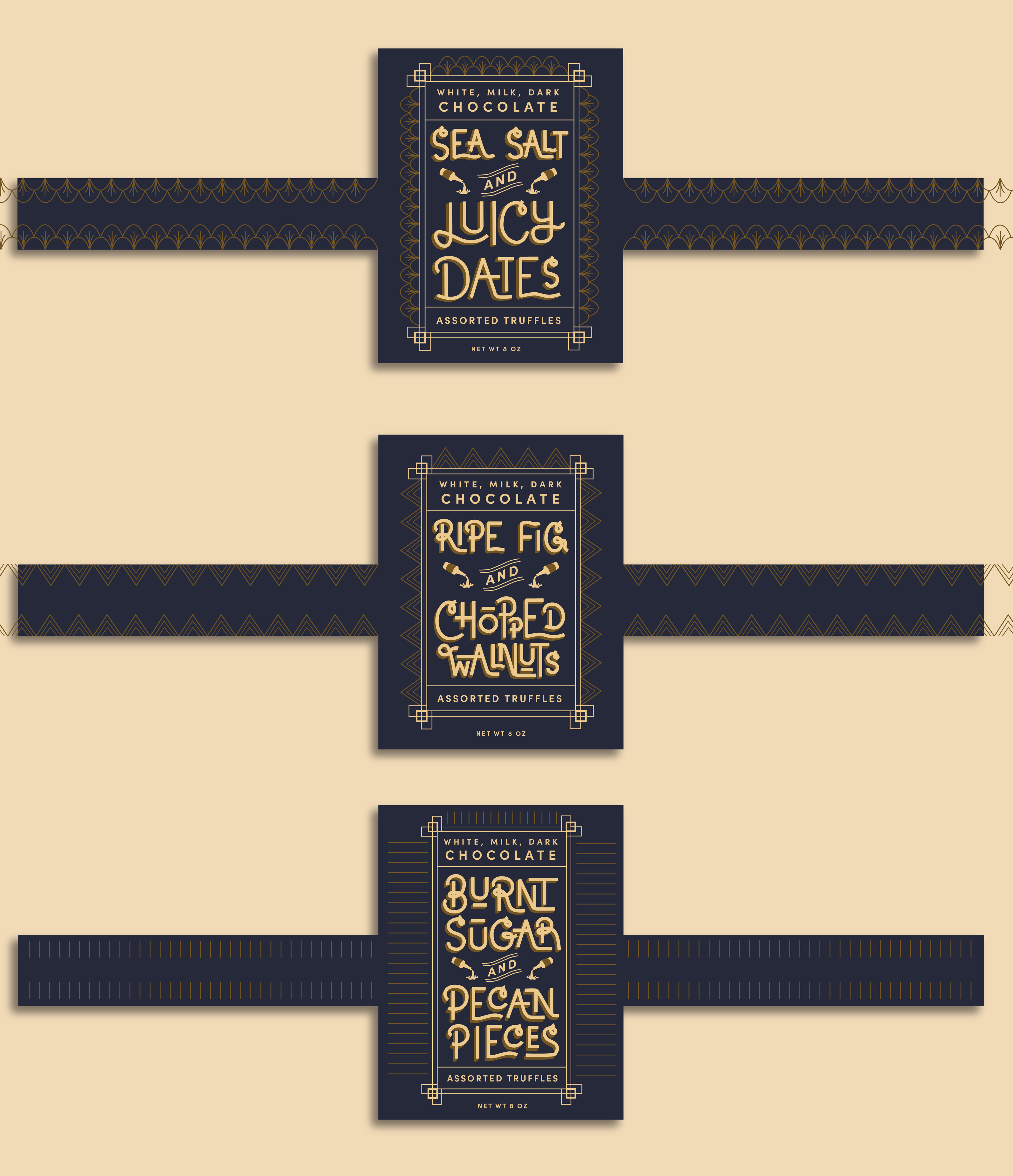
To achieve this, I designed a collection of chocolates with peel and reveal mechanics that turn ‘opening’ into ‘unboxing.’ Inspired by the secretive glamour of prohibition era speakeasies, the outside is adorned with 20s-inspired typography and the inside layer features one of three flapper characters.
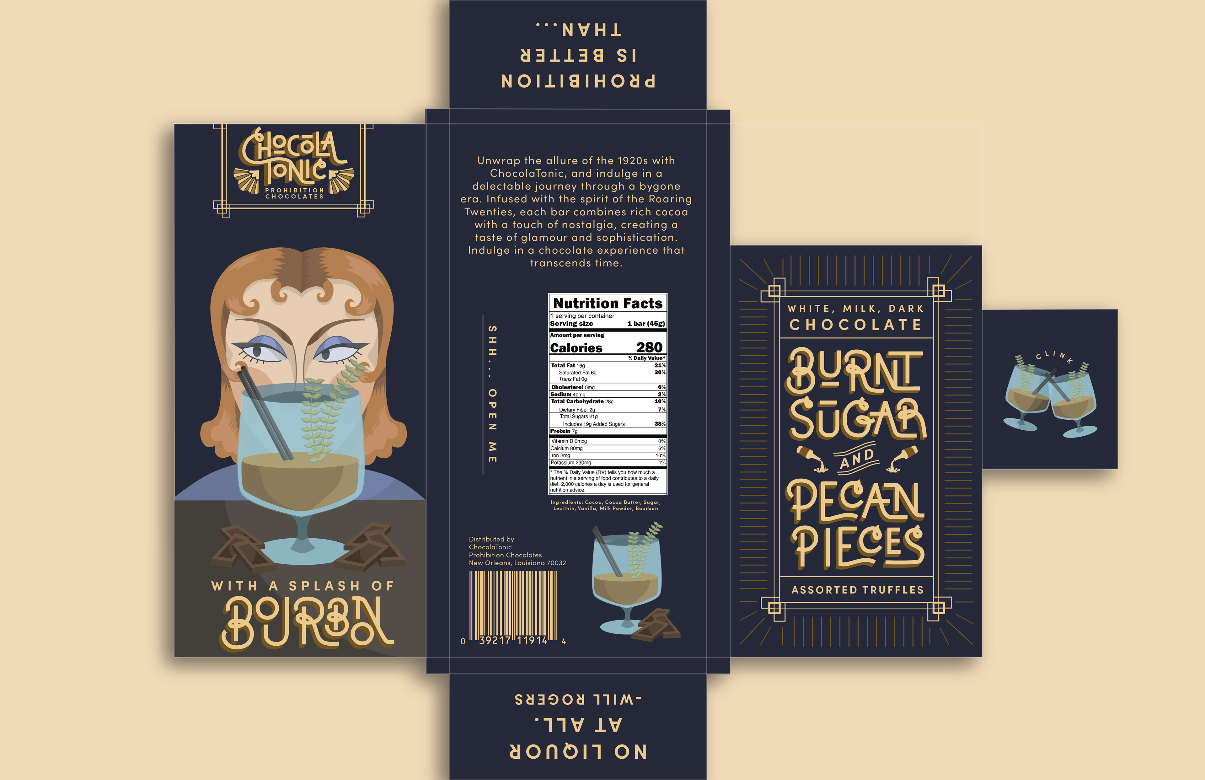


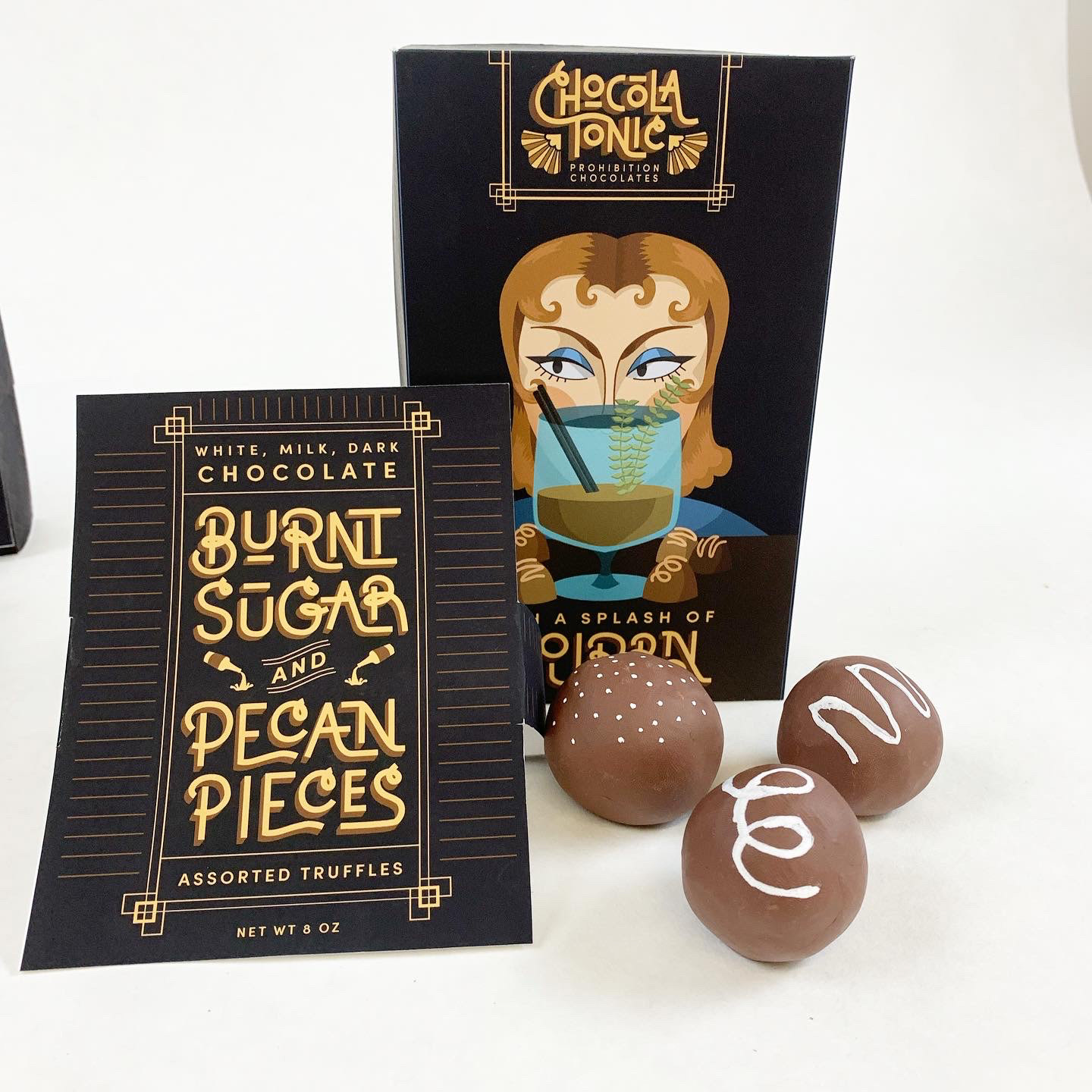
These are a few color print tests I mocked up to test the mechanics of my design.
Take a look into my brainstorming process with these sketches...